


The surgeon, in context.
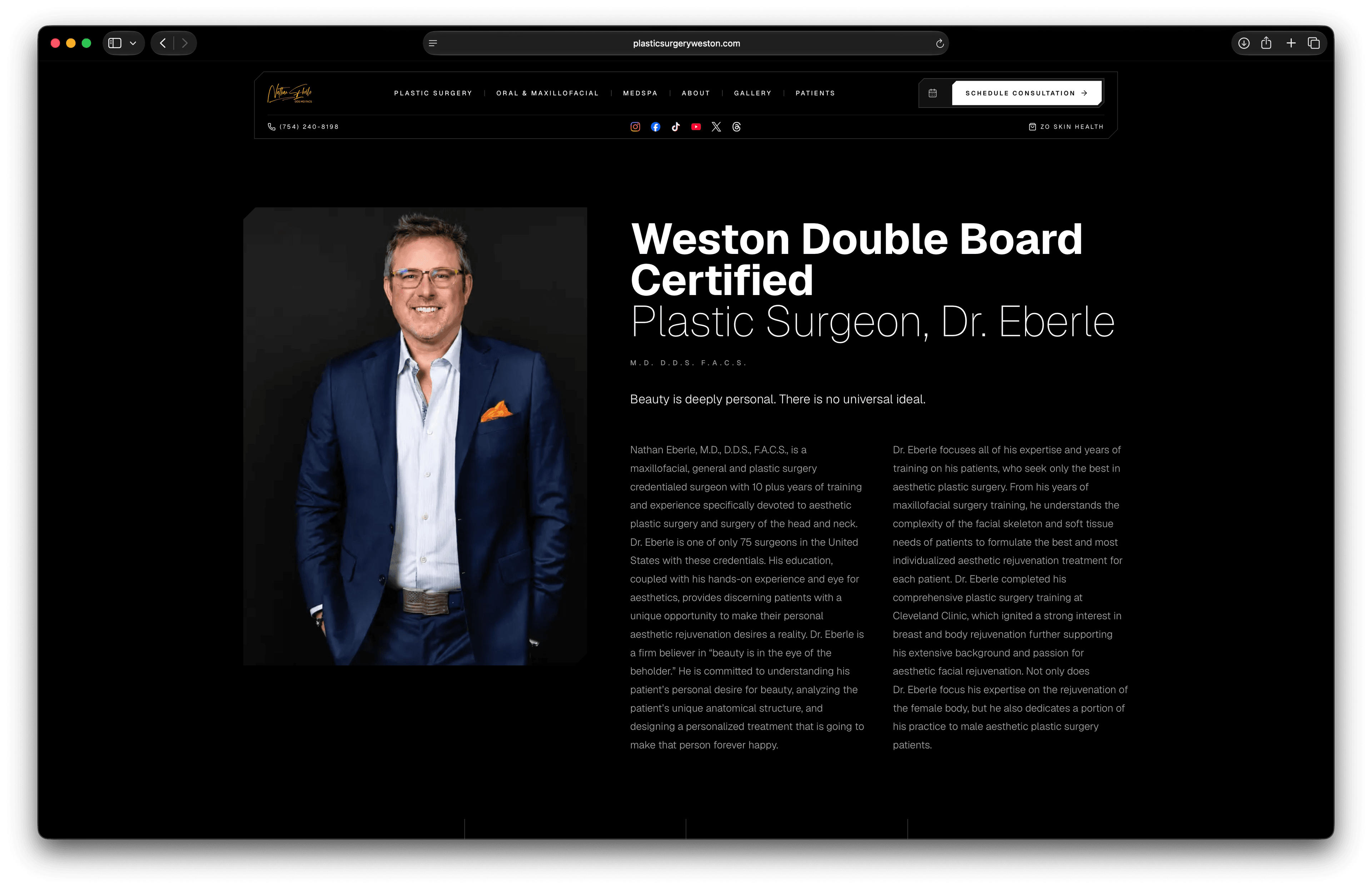
Portrait and credentials at scale. Biography in two columns with M.D., D.D.S., F.A.C.S. at editorial weight. Not a YouTube embed and a paragraph of template text.
Rebuilt from first-principles. Designed & engineered with an architecture, typography, and photography that only AestheticOS could build.
plasticsurgeryweston.com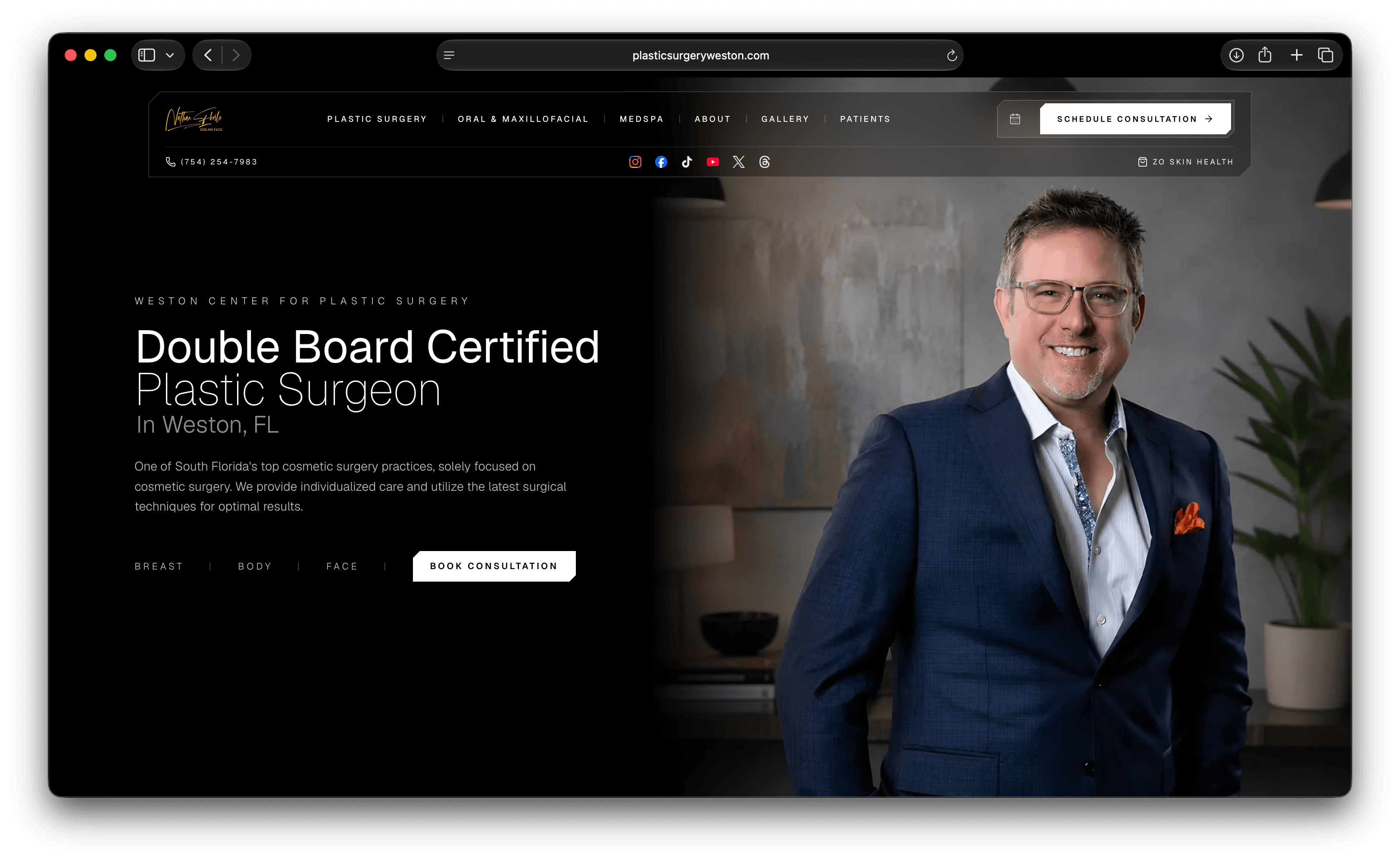
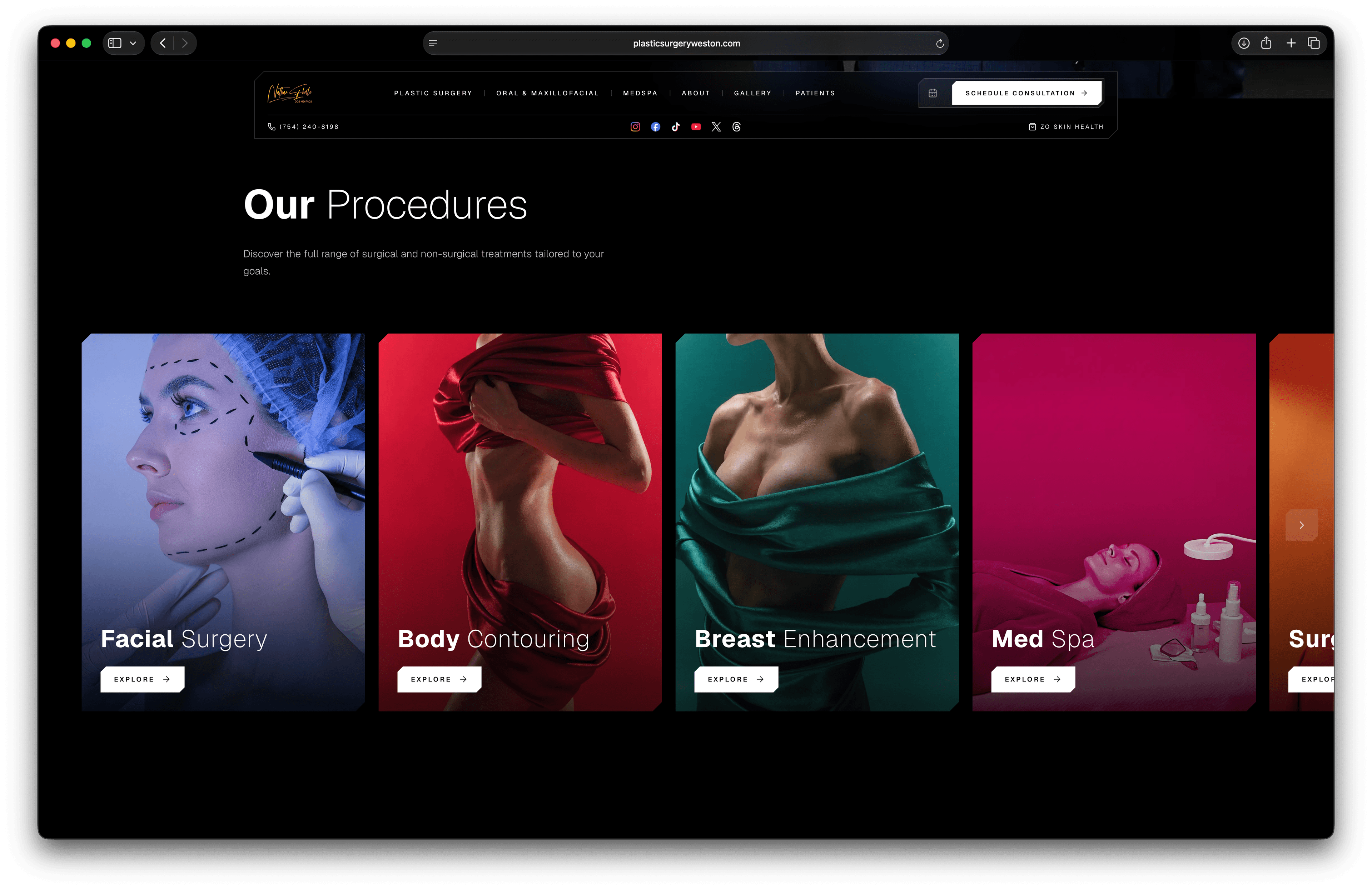
Blue, red, green, pink, orange. Each surgical category gets its own palette and imagery. Color is the navigation. One carousel under the hero shows patients the full scope of the practice.
10x
Faster Loading Time
Rebuilt, not optimized. The old Weston site was a template weighed down by plugins and patches. We replaced it with one coherent build from first principles.
Six paths across the full practice. Surgery, oral and maxillofacial, medspa, about, gallery, and patients. Each path opens into glass with clear structure.
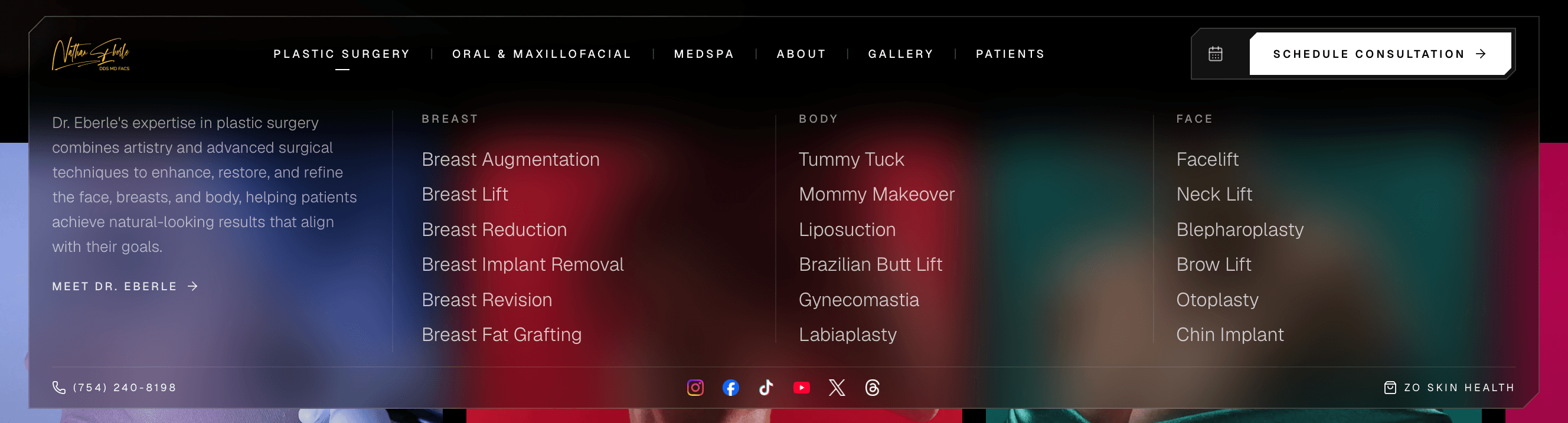
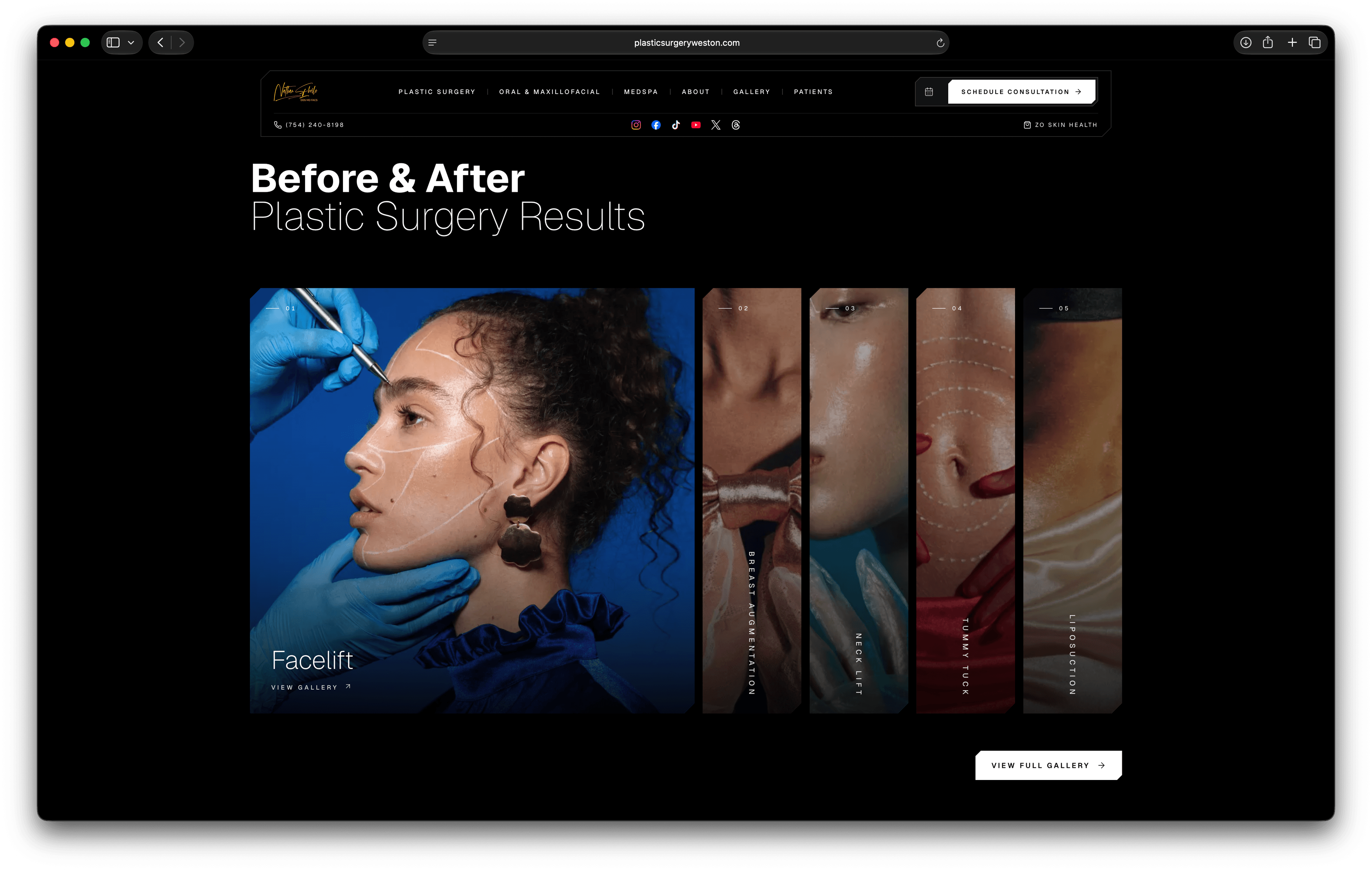
Fluid animation. Cards expand with a smooth transition. Click the image to open that procedure's gallery page. The preview photography is editorial and staged, not real patient before and afters.
Portrait and credentials at scale. Biography in two columns with M.D., D.D.S., F.A.C.S. at editorial weight. Not a YouTube embed and a paragraph of template text.
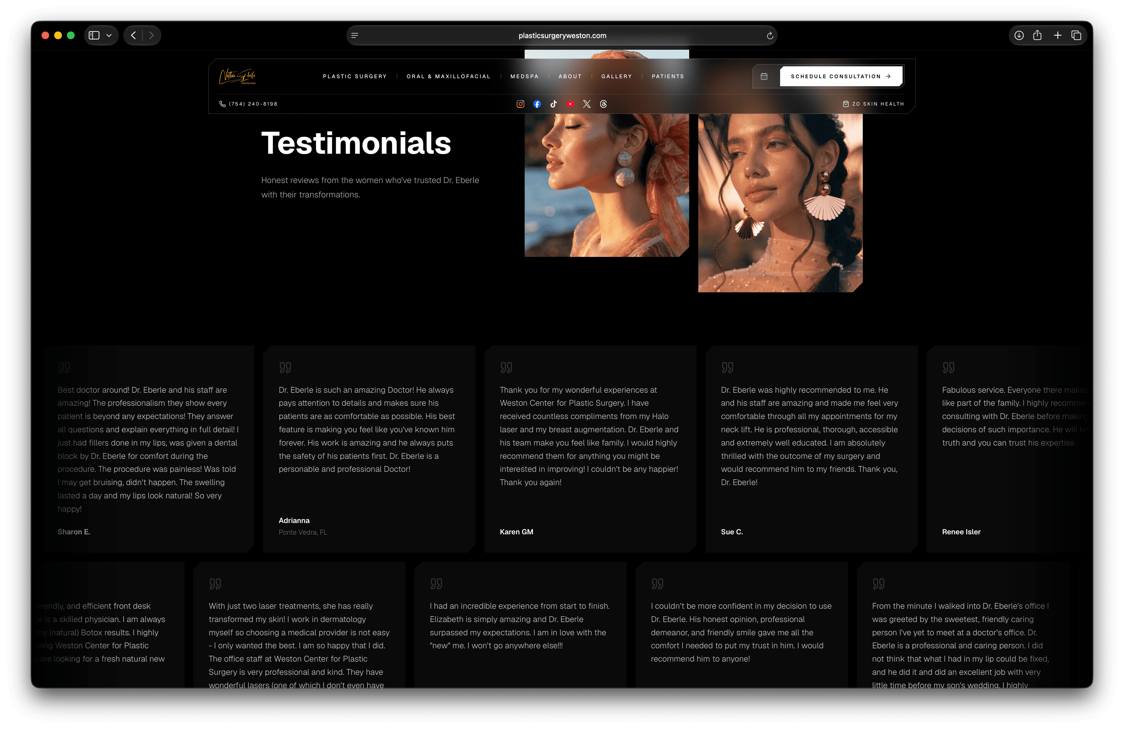
Dual-track marquee scroll. Patient quotes move horizontally beneath editorial portrait photography. Two continuous rows so reviews keep flowing without arrow buttons.
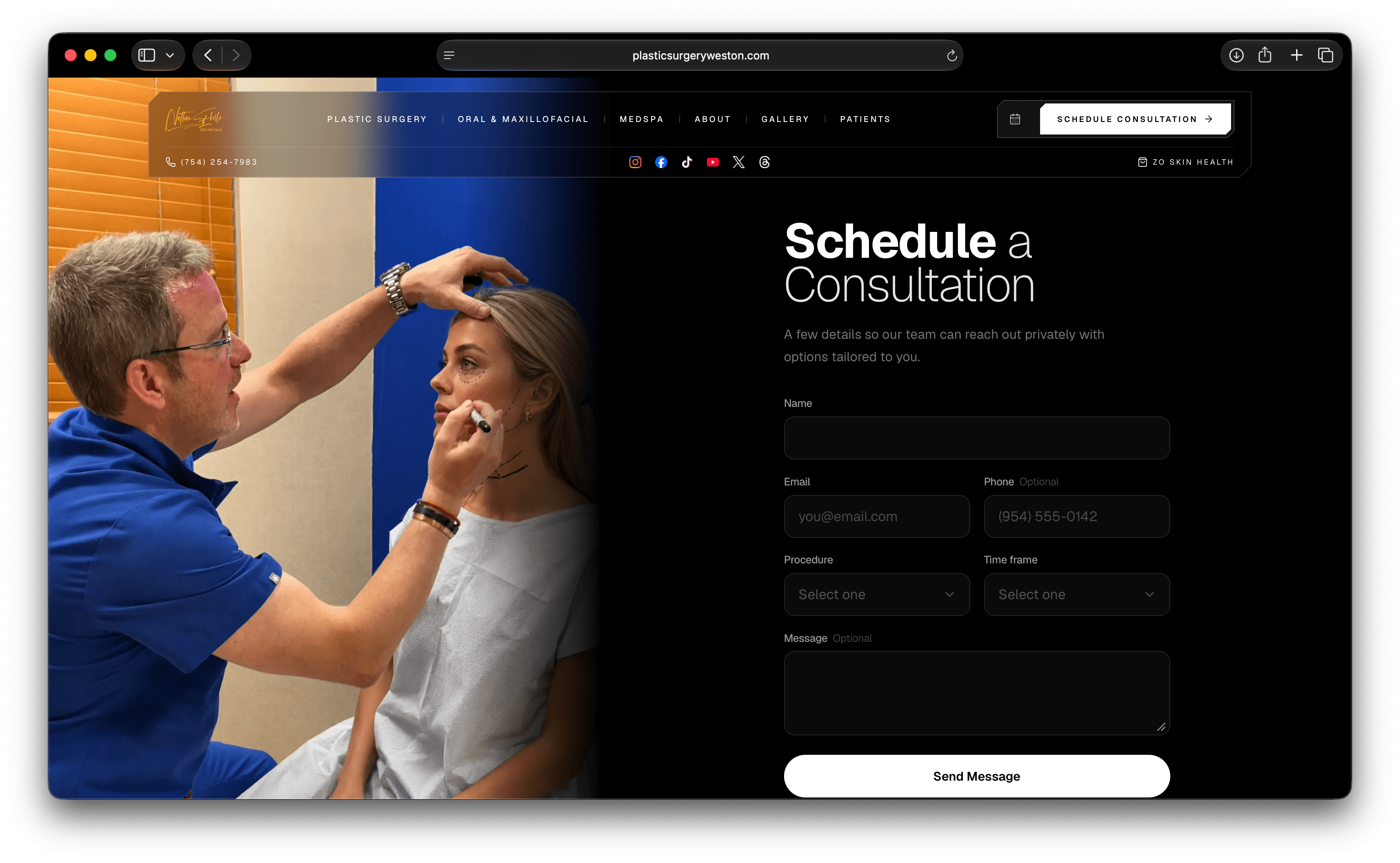
Structured fields beside clinical photography. Procedure and timeframe as selects on a split layout built to convert.
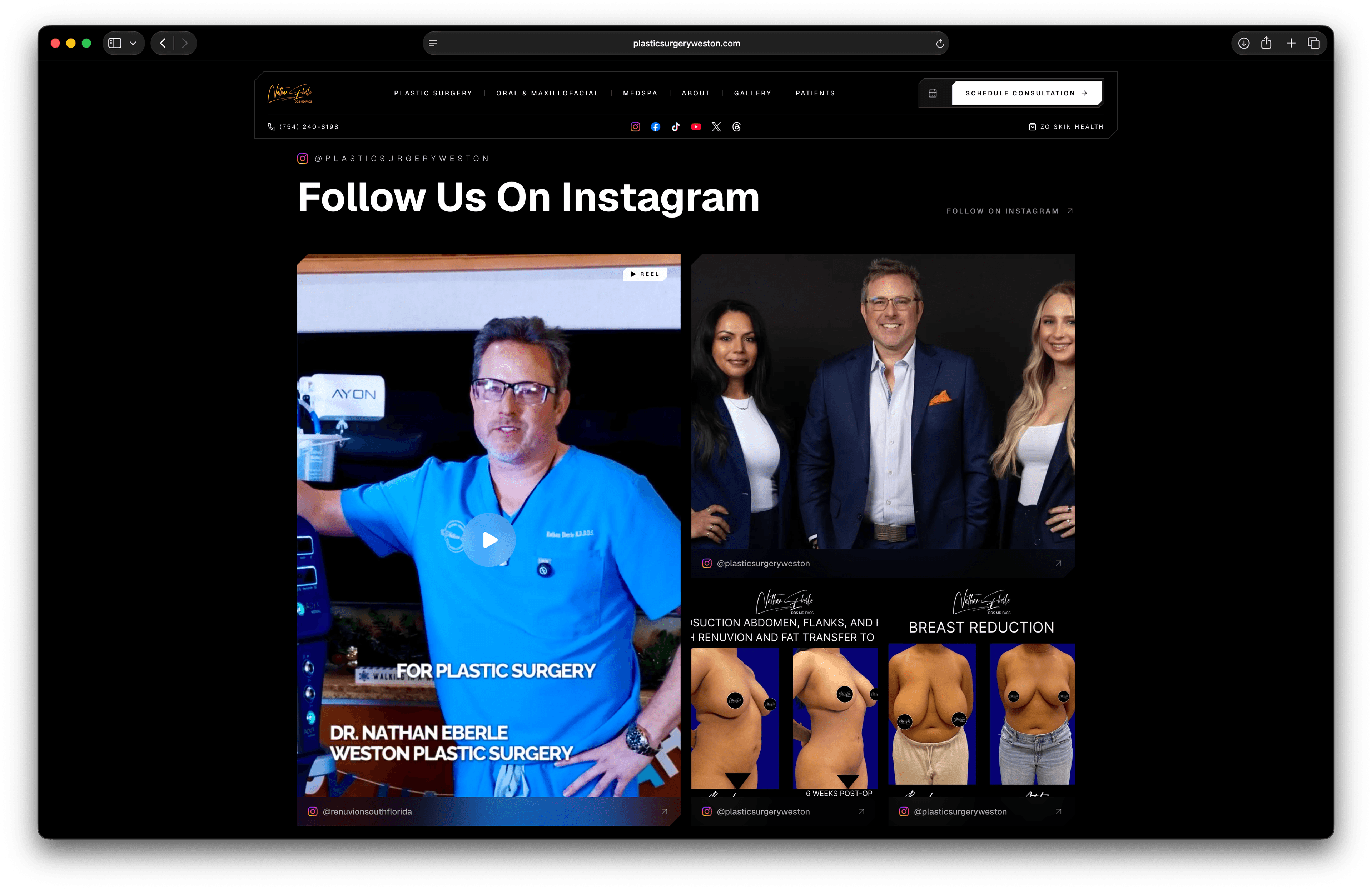
Instagram as a designed hub. A masonry grid pulling @plasticsurgeryweston into the build. Staff, reels, and results without a generic embed widget.
Most plastic surgery websites are decorated. This one was engineered.